Award-winning story shows impact, potential of data journalism tools
Sometimes the best story ideas come from a random discussion that sparks a light bulb moment.
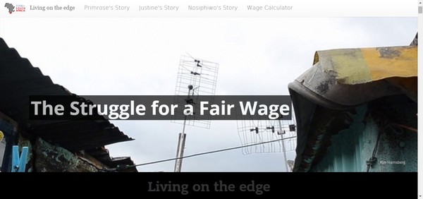
And so it was with Living on the Edge, a data-driven multimedia story by Kim Harrisberg, which recently won the national online category of the Vodacom Journalist of the Year awards, South Africa’s most prestigious journalism awards.
“This entry shows brilliant use of the online medium to unpack what could have been a standard human-interest story, said one of the online judges, Arthur Goldstuck, in the winning citation. “It combines text, video, images, graphs, charts, graphics and links to documents and sources that back up and verify statements and claims, in an aesthetically pleasing manner. It is both well-told and well-presented, becoming an online showcase for the issue being covered.
The story had its genesis in two random conversations involving Adi Eyal, who heads up the Cape Town-based civic tech nonprofit Code for South Africa. The first was with his domestic worker when he discovered that she was spending 20 percent of her monthly salary on transport. He immediately upped her pay, but it made him realize that many other employers were probably also unaware of their domestic workers’ personal circumstances.
Soon afterwards he found himself at a child’s birthday party listening to a group of middle class women discussing what they paid their household staff, with the only guidance coming from the (very low) legislated minimum wage for domestic workers.
“There are around a million domestic workers in South Africa and they do important work, including helping raise our children, yet when it comes to deciding on a fair wage, employers turn to friends and neighbors to ask for advice,” says Eyal.
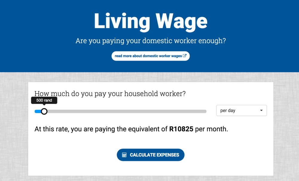
As a techie and a talented data analyst, Eyal set out to find a tech solution, but was adamant that it had to be driven by proper research. So he offered a fellowship to a Harvard student, Osman Siddiqi, who came to South Africa as part of his master’s degree program to do the research for a calculator that could help employers arrive at a fair wage for their domestic workers.
“It’s not intended as a name-and-shame tool, but rather to be educational and to help employers get a better idea of the personal circumstances of the person who is such an integral part of their household,” said Eyal.

The next step was to put a human face to the story to help bring the data to life, which Harrisberg did by focusing on three women and their personal circumstances.
Code for South Africa is at the center of attempts to embed a culture of data-driven storytelling in South Africa’s newsrooms, and the story was intended to showcase how data could be brought to life in an interesting and accessible way. As editor on the story, I also wanted to show how data journalism is a team sport involving people with different skills sets. The objective was to show how it was possible to use free tools, as well as to showcase existing tools, to tell a story.
So we chose to use the Storybuilder platform and added embedded interactive charts and graphics from Wazimap to provide context. The calculator tool was built by coder Petrus Janse van Rensburg and the story was designed by Jason Norwood-Young.
Part of the longer-term strategy was also to build a story that could be easily localized by simply changing the case studies and Wazi embeds, while keeping the national aspect of the story and the underlying technology. Several publications have already expressed an interest in regionalizing the story, and we are planning simple step-by-step editorial and tech guides for customizing it.
This is seen as a way of extending the life and reach of a story by making it simple and inexpensive to repurpose; the plan is to do this more often with stories in the future.
From the very beginning it was intended that the calculator would have a life beyond the domestic workers story. The information in the tool relates to many different types of workers. So, we are now planning to do a story about workers in the notoriously exploitative hotel and hospitality industries. The calculator will once again be at the heart of the story, as a tool that workers can use to calculate what they should earn and to argue for better pay.
We also included a simple Google form in the domestic workers story that asked two questions: where do you live, and how much do you pay your domestic worker? This attracted 12,500 responses, creating a valuable national database of salaries. This led to a follow-up story, which then inspired this blog by ICFJ Fellow Chris Roper.
Like the conversations that sparked the story, the story in turn sparked new thinking about how to extend the life and reach of stories and tools. We also hope it will help convince skeptical South African journalists and media houses that good data-driven storytelling is not only affordable but also not too difficult to do.
Post originally published on the IJNET blog on 11 December 2015

