Mapping sanitation
In April, Code for South Africa was approached by Ndifuna Ukwazi, a non-profit law centre in Cape Town, to create an online map visualisation of Cape Town’s informal settlements.
Ndifuna Ukwazi (NU), in partnership with Social Justice Coalition (SJC) and International Budget Partnership (IBP), had developed two databases of informal settlements in the City of Cape Town. They had also discovered some anomalies in the City’s budget allocations to capital spending on sanitation in informal settlements, specifically that budget allocations were not being increased in proportion to the growth of the informal settlements.
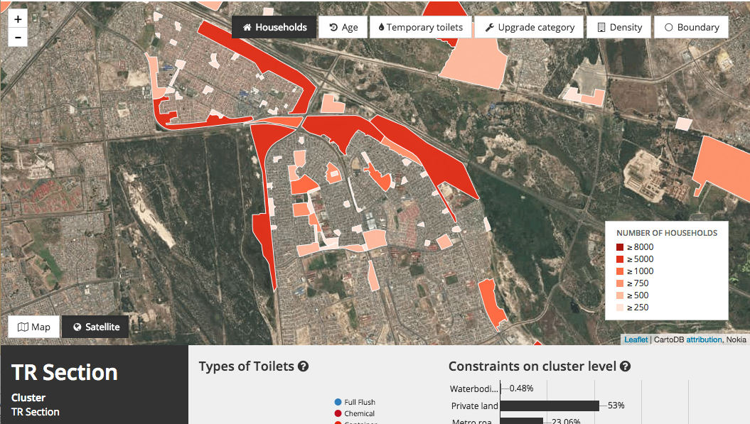
The purpose of the map visualisation was to highlight the lack of sanitation services in informal settlements in Cape Town, and address the City of Cape Town’s capital expenditure budget for informal settlement upgrades, which has not increased in eight years. You can explore the map here.
The two datasets provided were compiled from data acquired through Promotion of Access to Information (PAIA) requests to the City and contained the following:
-
Informal settlement data containing GPS coordinates of temporary and permanent toilets installed by the city, detailing type and location.
-
An excel spreadsheet with details on informal settlements, including the age, size in hectares and number of households per informal settlement, as well as the City’s breakdown of constraints that hinder the upgrade of these settlements.
Constraints are elements that restrict the building of permanent toilets in informal settlements. The City of Cape Town currently lists 15 constraints that prevents them from upgrading sanitation in settlements.
This was exciting news for us, as it presented an opportunity to update and enrich a dataset we had already done much work on, which you can read more about here. We also needed to find the best way to display these rich layers of data in an online map environment.
But first we needed to get the data on the map.
Mapping the data
We had two sources of data to assist with the geo-location of the informal settlements. The first was GPS coordinates of sanitation facilities in the settlements. These weren’t always evident, nor accurate. The second was a hard copy map of the informal settlements from the City of Cape Town.
Initially we wanted to use Tableau, an interactive data visualisation software we occasionally use and teach our students at the Code for South Africa Data Journalism Academy. For a project of this scope, however, we needed more freedom and control over features and interactivity than Tableau offers.
NU had asked for a number of relatively complicated features, including changing layers, changing the basemap and custom interactivity when clicking on elements on the map. For this reason we decided to use CartoDB, which allowed us to easily map the data and build features on top of it.
Once the data was mapped out, it was handed to our developers to build the tool.
Mapping the experience
“The next step was to make the map interactive,” said Guus Hoekman, web developer at Code for South Africa. “We wanted the map to be an experience, more like a tour of informal settlements than just a boring report of toilets per settlement.”
Three specific features we were aiming for were:
- Being able to switch between individual layers and view parts of the data separately, eg: age of settlements, number of households, etc,
- Being able to change between map and satellite view, similar to Google Maps,
- Being able to click on an informal settlement or pocket and receive detailed information about that area.
While conceptualising the tool, we realised that if users landed directly on the map, certain features or functions wouldn’t be obvious. We needed to find a way to teach people how to use the map and give users context to the data at the same time.
For this reason, we created a detailed navigation process consisting of an interactive tutorial with clear guidelines, definitions of each layer as they’re selected, clear call to actions when a click is required and ‘next’ and ‘back’ buttons to move between sections.
For a behind the scenes look at this development process, read Guus’ blog here.
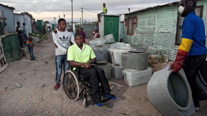
To complete the picture, we added two real life on-the-ground stories of people living in these informal settlements with poor or no access to sanitation to give the data a human element.
“It’s one thing to look at the numbers and be aware that there are no toilets in an informal settlement. It’s another to see how Asithandile, a disabled resident of the Kosovo Informal Settlement suffers because he cannot access the temporary toilets by himself,” said Guus.

Code for South Africa is a civic technology organisation that promotes informed decision making for positive social change. Through our projects, our recently launched Code for South Africa Data Journalism Academy and Codebridge project space, we bring together civil society organisations, journalists, technologists and government to create tools and stories that address society’s challenges.
The Informal Settlement map is a great example of collaboration between these stakeholders to create a useful tool for society.
We could never have achieved this without the collaborative efforts of Ndifuna Ukwazi, Social Justice Coalition, International Budget Partnership and the hard work of the project team:
Julia Renouprez: Data Wrangler
Guus Hoekman: Developer
Layla Ryklief: Developer and designer
JD Bothma: Developer
Raymond Joseph: Data Journalist and head of the Code4SA Data Journalism Academy

